Choosing A Logo Version
Which version should I use?
- Stacked full name: most versatile; works for a variety of situations and audiences
- One line full name: great for applications where space is thin and long, such as pens and banners
- One line East Texas A&M: great for applications where space is thin and long, such as pens and banners
- Vertical East Texas A&M: most versatile; works for a variety of situations and audiences
- Horizontal ETAMU: best for informal uses such as student organizations
- Vertical ETAMU: best for informal uses such as student organizations
What are my color options?
Use the two-color version whenever possible.
- Choose the version that creates the most contrast
between the background and the logo. - The lion head should always be lighter than its
background. - Printing in color: Use the two-color CMYK version.
- Printing in black and white: Use the one-color version
in black or white depending on the background color. - Limited budget: Use the one-color PMS logo.
What size is best?
Digital: For screen displays, logos should never appear smaller than 120 pixels
wide (stacked full name) and 60 pixels wide (vertical A&M-Commerce).
Print: Logos should not be printed smaller than the following:
What backgrounds can I use?
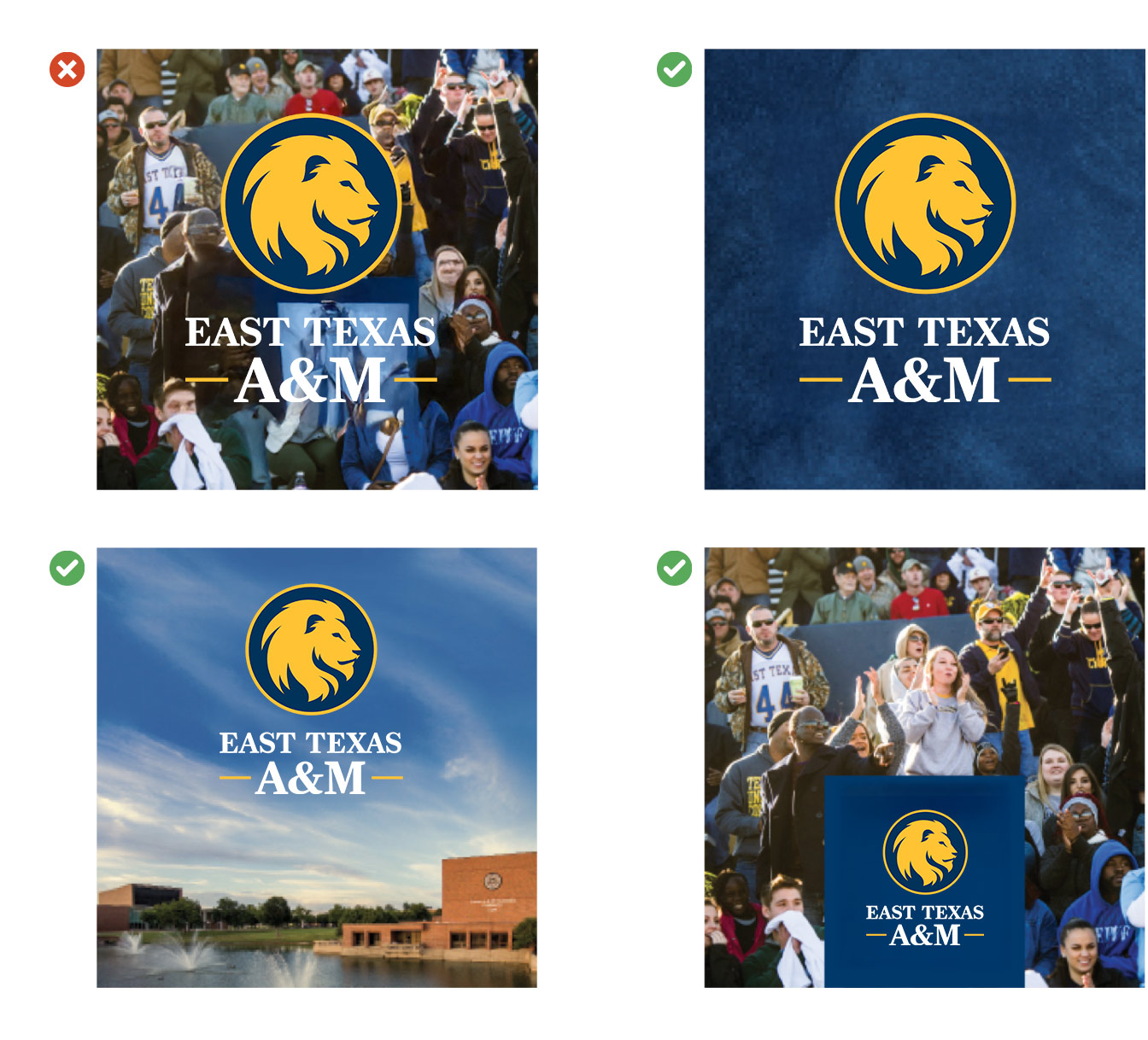
If you need to use a photographic background, find a calm or neutral area to position the logo. If it's hard to find a neutral area, create an area of clear space or color where the logo can sit.


