- On this page:
-
 Headline Fonts
-
 Decorative Fonts
-
 Body Fonts
-
 Contact Us
Fonts
Portraying Confidence
Functional, bold, confident typefaces that represent East Texas A&M. Typography is an expression of our brand personality and can affect the mood of our communications.
fonts that communicate our brand
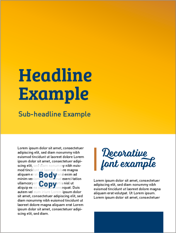
The typefaces chosen to represent East Texas A&M are functional, bold and confident. Follow these guidelines when using them:
- HEADLINE FONTS can be used in publications for primary titles, headlines and subheads. If you choose a bold headline weight, balance it out with a subhead in a lighter weight and vice versa.
- DECORATIVE FONTS should be used sparingly and are for accent use only. They should not be used on sentences, long phrases, headlines or subheads.
- BODY FONTS are used for the main copy of a publication. This can include bullets, paragraphs and other detailed information.
All of these fonts are available through your Adobe Creative Cloud Account (free to all university employees and students).

Headline Fonts
Din Family (Non-Condensed)

Additional Weights

Bree Serif Family

Additional Weights

Decorative Fonts
Din Condensed Family

Additional Weights

Voltage

Additional Weights

Body Fonts
Din Regular

Minion Regular*

*Consider the tone, purpose and audience of your message before choosing Minion as your body font. It is best used for formal or more elegant communications.
Brand Guidelines :: Up Next-Fonts
Up Next
Explore our brand’s
Marcomm :: Contact us
Contact Us
- Office of Marketing and Communications
- 903.886.5128
- [email protected]
- Binnion Hall, 140
- 1500 Education Drive
- Commerce, TX 75428


