Unit Lockups
The Power of Our Brand
Use a lockup to celebrate and differentiate the value of your university organization and each unique department while supporting our parent brand.
A “lockup” is a formal combination of the department's name, East Texas A&M logotype and lion head. Lockups are meant to identify departments while also aligning with the university's primary logo system. In doing so, the department leverages the value and power associated with the East Texas A&M brand and benefits from immediate recognition and credibility. Unique and divergent department logos create confusion with our audiences and undermine the university's visual identity. While we all seek to communicate, celebrate and differentiate the value of the university organization where we work, there can be no graphic identity more powerful than our parent brand.
Request a lockup by emailing [email protected]
COLLEGES, SCHOOLS, DIVISIONS AND CENTERS
Departments, Associations and Initiatives
LOGO USE AND CREATION
The university is a complex organization comprised of many groups, offices, departments and colleges. In order to create a cohesive set of unit lockups, we created a template that works for everyone within the organization.
Use Guidelines
The East Texas A&M name and logos may only be used:
- In affiliation with official university programs, groups and organizations
- For university-approved activities
- In association with content that aligns with the university's values. References to drugs, alcohol and other inappropriate content are not permitted.
Horizontal lockup
- Most versatile; works for a variety of situations and audiences
Vertical lockup
- Great for apparel or applications where space is thin and long, such as pens and banners.
- Contact the Office of Marketing and Communications if your merchandise requires a variation of this layout.
- Use the two-color version whenever possible.
- Choose the version that creates the most contrast between the background and the logo.
- The lion head should always be lighter than its background.
- Printing in color: Use the two-color CMYK version.
- Printing in black and white: Use the one-color version in black or white depending on the background color.
- Limited budget: Use the one-color PMS logo.
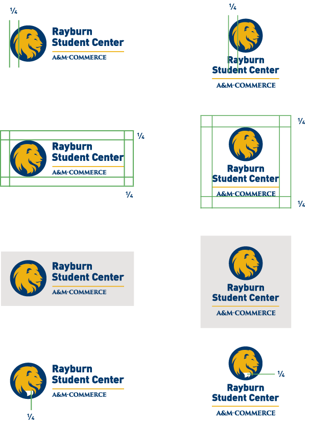
Clear space is necessary to provide breathing room around the logo. Leave a clear
space around the top, bottom, left and right of the logo that is at least one-fourth the
width of the circle. That's about the width of the bottom section of the mane.
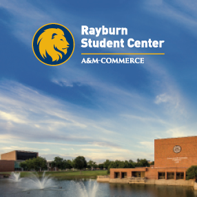
The logo's background should be carefully and thoughtfully chosen. Make sure that it maintains the proper amount of contrast for readability. Do not place the logo over busy images, patterns or backgrounds.



Do not alter or replace the typefaces.

Do not stretch, condense or change its dimensions or relative scale.

Do not attach the university name to alternate symbols or create your own logo.

Do not add, remove, deconstruct or rearrange the elements. For example, do not remove the entire lion head and circle.

Do not skew, warp or rotate the identity.

Do not apply your own outline or effects to the logo or change the colors.

If you need to identify more than one university entity equally on a communication, use the following guideline:
Sponsored by:


Sponsored by:
Student Career Preparedness
Fraternity and Sorority Life
Approval
The Office of Marketing and Communications must review the proper use of all items that include unit lockups. Please send the artwork to [email protected].
Creation Guidelines
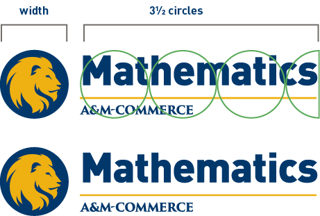
If unit name is longer than 3.5 circles, use the colleges, schools, divisions and centers three-line unit logo or departments, associations and initiatives two-line unit logo format.


Up Next
Explore our brand's
Contact Us
- Office of Marketing and Communications
- 903.886.8143
- [email protected]
- Binnion Hall, 140
- 1500 Education Drive
- Commerce, TX 75428


 Colleges, Schools, Divisions and Centers
